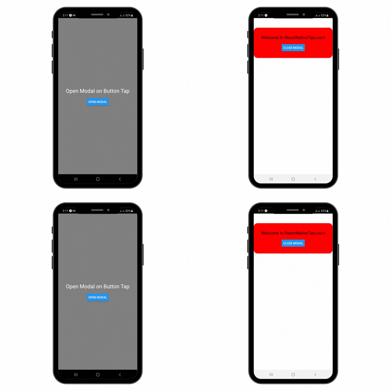
Opening a modal on a button click in React Native is a common task. React Native provides a Modal component that can be used to present content above an enclosing view. Here’s a basic example to demonstrate how to open a modal when a button is clicked:
React Native App Basic Structure:
Our journey begins with a simple React Native application. Here’s a starter template that you’ll typically find in a new React Native project:
import React from 'react';
import { StyleSheet, Text, View, StatusBar } from 'react-native';

export default function App() {
  return (
    <View style={styles.container}>
      <Text>Open up App.js to start working on your app!</Text>
      <StatusBar style="auto" />
    </View>
  );
}

const styles = StyleSheet.create({
  container: {
    flex: 1,
    backgroundColor: '#fff',
    alignItems: 'center',
    justifyContent: 'center',
  },
});
Integrating the Modal Component:
Next, we integrate the Modal component. This involves importing the Modal component from React Native, along with useState for managing its visibility.
import { Modal, Button } from 'react-native';
Managing Modal Visibility with State:
React Native uses state to manage component data. We’ll use the useState hook to control the modal’s visibility.
const [modalVisible, setModalVisible] = useState(false);
Creating the Button to Trigger the Modal:
Now, let’s add a button to our view. This button, when pressed, will set our modal visibility to true, thus displaying the modal.
<Button title="Open Modal" onPress={() => setModalVisible(true)} />
Designing the Modal:
Here’s how you can design a basic modal. We’ll add text and a close button inside the modal. The close button reverses the state, hiding the modal.
<Modal
  animationType="slide"
  transparent={false}
  visible={modalVisible}
  onRequestClose={() => {
    setModalVisible(!modalVisible);
  }}
>
  <View style={styles.modalView}>
    <Text>Welcome to ReactNativeTips.com</Text>
    <Button title="Close Modal" onPress={() => setModalVisible(!modalVisible)} />
  </View>
</Modal>
Styling the Components:
Styling is crucial for a good user experience. React Native uses a StyleSheet to define styles. Here’s an example of styling the container and the modal:
const styles = StyleSheet.create({
  container: {
    flex: 1,
    backgroundColor: 'grey',
    alignItems: 'center',
    justifyContent: 'center',
  },
  modalView: {
    marginTop: 50,
    backgroundColor: "red",
    borderRadius: 20,
    padding: 35,
    alignItems: "center",
    shadowColor: "#000",
    ...
  },
});
App.js File
import React, { useState } from 'react';
import { StyleSheet, Text, View, Modal, Button, StatusBar } from 'react-native';

export default function App() {
  const [modalVisible, setModalVisible] = useState(false);

  return (
    <View style={styles.container}>
      <Text style={{marginBottom:20, fontSize:25 , color:'white'}}>Open Modal on Button Tap</Text>
      <Button
        title="Open Modal"
        onPress={() => setModalVisible(true)}
      />
      <Modal
        animationType="slide"
        transparent={false}
        visible={modalVisible}
        onRequestClose={() => {
          setModalVisible(!modalVisible);
        }}
      >
        <View style={styles.modalView}>
          <Text style={{marginBottom:20, fontSize:20}} >Welcome to ReactNativeTips.com</Text>
          <Button
            title="Close Modal"
            onPress={() => setModalVisible(!modalVisible)}
          />
        </View>
      </Modal>
      <StatusBar style="auto" />
    </View>
  );
}

const styles = StyleSheet.create({
  container: {
    flex: 1,
    backgroundColor: 'grey',
    alignItems: 'center',
    justifyContent: 'center',
  },
  modalView: {
    marginTop: 50,
    backgroundColor: "red",
    borderRadius: 20,
    padding: 35,
    alignItems: "center",
    shadowColor: "#000",
    shadowOffset: {
      width: 0,
      height: 2
    },
    shadowOpacity: 0.25,
    shadowRadius: 4,
    elevation: 5
  },
});
Output Results:

Explanation:
-
- The
useStatehook is used to create a state variablemodalVisibleto track whether the modal should be visible or not. - The
Modalcomponent is used to render the modal. Itsvisibleprop is controlled by themodalVisiblestate. - There are two buttons: one outside the modal to open it and another inside the modal to close it.
- The
onPressprop of each button is used to set the state, thereby toggling the visibility of the modal.
- The
Styling and Additional Options:
-
- You can style the modal and its contents as needed using the
styleprop. - The
Modalcomponent also supports other props for customization, such asanimationTypeandtransparent.
- You can style the modal and its contents as needed using the
Error Handling:
-
- The
onRequestCloseprop on the Modal is required on Android and can be used to handle the hardware back button press.
- The
This is a basic example of Open Modal on Button Click in react native. Depending on your application’s requirements, you can customize the modal further, such as adding more complex layouts, and animations, or even using third-party modal libraries for more features.

