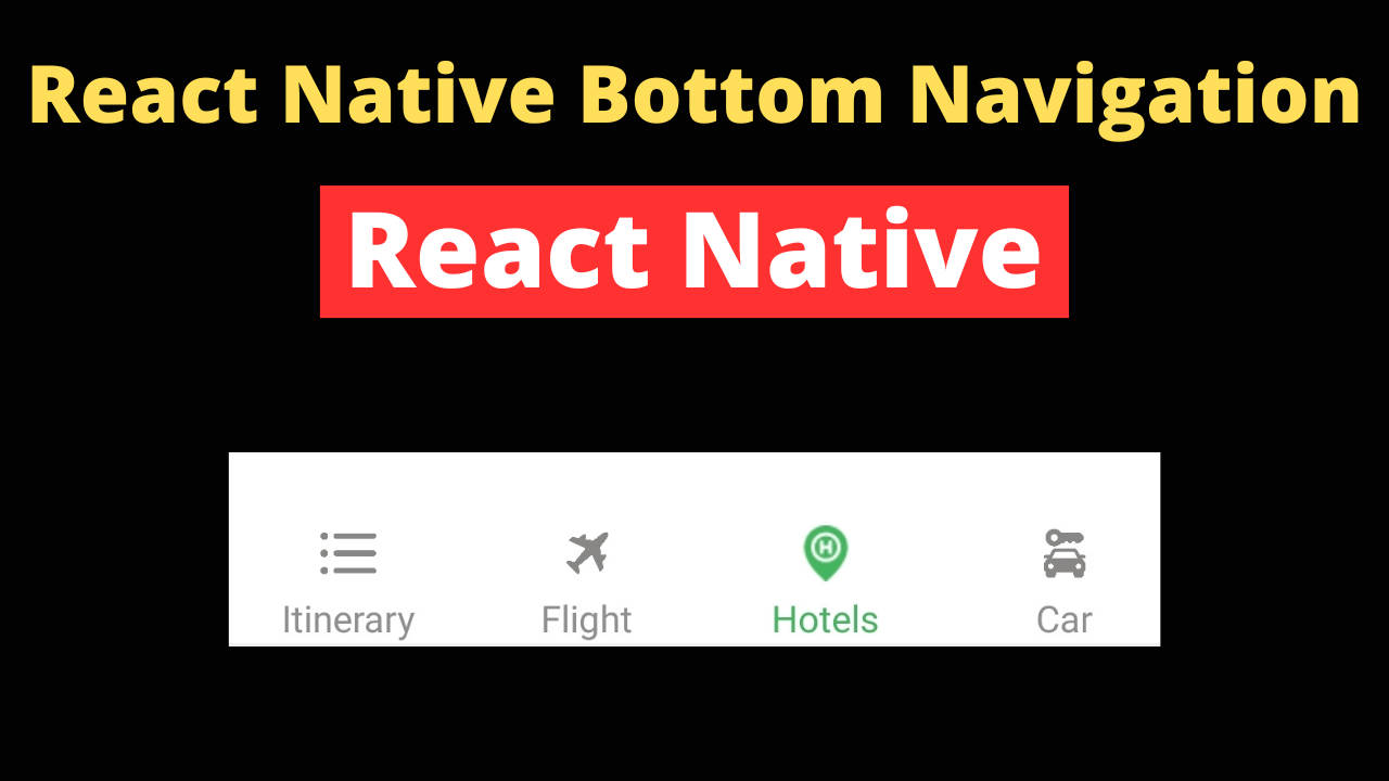
Bottom navigation bars are a staple in mobile app design, allowing users to easily navigate between the app’s main sections with a single tap. This navigation pattern is especially prevalent in apps where quick switching between tabs is essential for a smooth user experience. In the context of React Native, incorporating a bottom navigation bar not only enhances usability but also aligns with modern design practices, making your app intuitive and accessible.
Create a New React Native Project:
Begin by setting up a new project if you haven’t already:
npx react-native init MyProject
Essential Dependencies:
Install react-navigation and other necessary libraries:
npm install @react-navigation/native
Additionally, install dependencies for the navigation library to work with your environment:
npm install react-native-screens react-native-safe-area-context
Installing react-navigation
React Navigation is the go-to library for managing navigation in your app. Install it along with the bottom tabs navigator:
npm install @react-navigation/bottom-tabs
Creating the Bottom Tab Navigator
Introduce createBottomTabNavigator from @react-navigation/bottom-tabs to set up your bottom navigation bar. Configure your screens, labels, and icons within this navigator.
Choosing and Importing Icons
Use react-native-vector-icons for a wide range of icon options. Install the library and choose suitable icons for your tabs:
npm install react-native-vector-icons
Import your selected icons into your project. For example:
import Ionicons from 'react-native-vector-icons/Ionicons';
Basic App Setup
In your App.js, start by importing necessary components and libraries:
import React from 'react';
import { NavigationContainer } from '@react-navigation/native';
import { createBottomTabNavigator } from '@react-navigation/bottom-tabs';
import Ionicons from 'react-native-vector-icons/Ionicons';

// Dummy screen components
import HomeScreen from './screens/HomeScreen';
import SettingsScreen from './screens/SettingsScreen';

const Tab = createBottomTabNavigator();

function MyTabs() {
  return (
    <Tab.Navigator
      screenOptions={({ route }) => ({
        tabBarIcon: ({ focused, color, size }) => {
          let iconName;

          if (route.name === 'Home') {
            iconName = focused ? 'ios-home' : 'ios-home-outline';
          } else if (route.name === 'Settings') {
            iconName = focused ? 'ios-settings' : 'ios-settings-outline';
          }

          return <Ionicons name={iconName} size={size} color={color} />;
        },
        tabBarActiveTintColor: 'tomato',
        tabBarInactiveTintColor: 'gray',
      })}
    >
      <Tab.Screen name="Home" component={HomeScreen} />
      <Tab.Screen name="Settings" component={SettingsScreen} />
    </Tab.Navigator>
  );
}

export default function App() {
  return (
    <NavigationContainer>
      <MyTabs />
    </NavigationContainer>
  );
}
Assuming you have two screens (HomeScreen and SettingsScreen), you would set them up like so in the screens directory. Here’s an example of what HomeScreen.js might look like:
import React from 'react';
import {View, Text, StyleSheet} from 'react-native';

const HomeScreen = () => (
  <View style={styles.container}>
    <Text>Home Screen</Text>
  </View>
);

const styles = StyleSheet.create({
  container: {flex: 1, justifyContent: 'center', alignItems: 'center'},
});

export default HomeScreen;
SettingsScreen.js would look similar.
Configuring the Bottom Tab Navigator
Within your App.js, set up the bottom tab navigator:
const Tab = createBottomTabNavigator();

function MyTabs() {
  return (
    <Tab.Navigator
      screenOptions={({route}) => ({
        tabBarIcon: ({focused, color, size}) => {
          let iconName;

          if (route.name === 'Home') {
            iconName = focused ? 'ios-home' : 'ios-home-outline';
          } else if (route.name === 'Settings') {
            iconName = focused ? 'ios-settings' : 'ios-settings-outline';
          }

          // You can return any component that you like here!
          return <Ionicons name={iconName} size={size} color={color} />;
        },
        tabBarActiveTintColor: 'tomato',
        tabBarInactiveTintColor: 'gray',
      })}>
      <Tab.Screen name="Home" component={HomeScreen} />
      <Tab.Screen name="Settings" component={SettingsScreen} />
    </Tab.Navigator>
  );
}
Wrapping Everything in a NavigationContainer
Finally, ensure your MyTabs component is rendered inside a NavigationContainer:
export default function App() {
  return (
    <NavigationContainer>
      <MyTabs />
    </NavigationContainer>
  );
}
Best Practices for Bottom Navigation in React Native
Implementing a bottom navigation bar in React Native enhances user navigation and overall app usability. However, to maximize its effectiveness, adhere to the following best practices:
Icon Selection
- Relevance: Choose icons that clearly represent their tab’s function or content. Users should be able to understand the meaning of each icon at a glance.
- Clarity: Opt for simple, easily recognizable icons. Complicated graphics can confuse users or slow down their navigation efficiency.
- Consistency: Use a consistent icon style (e.g., line, filled, or flat) across all tabs to maintain a cohesive look.
Usability
- Number of Tabs: Keep the number of tabs between three and five. This range strikes a balance between offering enough navigation options and maintaining simplicity. Too many tabs can overwhelm users and make the app look cluttered.
- Prioritization: Place the most important navigation options at the center or starting positions of the bar. Users are more likely to focus on these areas.
- Accessibility: Ensure that the bottom navigation bar is accessible, including proper labeling for screen readers and adequate tap targets for users with motor impairments.
Consistency
- Design System Alignment: The bottom navigation bar should visually align with your app’s overall design system. This includes colors, fonts, and iconography.
- Feedback: Provide immediate visual feedback when a tab is selected (e.g., changing the icon color or animating the icon). This helps users understand that their action was recognized.
Advanced Customizations
For those looking to further enhance their bottom navigation bars, consider the following advanced customization options.
Custom Tab Bar Components
If the default bottom tab navigator doesn’t fully meet your design or functionality requirements, consider creating a custom tab bar component. React Navigation allows for the replacement of its built-in components with custom ones, giving you full control over the tab bar’s appearance and behavior.
import React from 'react';
import { View, TouchableOpacity, Text } from 'react-native';

const CustomTabBar = ({ state, descriptors, navigation }) => {
  return (
    <View style={{ flexDirection: 'row', justifyContent: 'space-between', padding: 10 }}>
      {state.routes.map((route, index) => {
        const { options } = descriptors[route.key];
        const label = options.tabBarLabel !== undefined
          ? options.tabBarLabel
          : options.title !== undefined
          ? options.title
          : route.name;

        const isFocused = state.index === index;

        const onPress = () => {
          const event = navigation.emit({
            type: 'tabPress',
            target: route.key,
            canPreventDefault: true,
          });

          if (!isFocused && !event.defaultPrevented) {
            navigation.navigate(route.name);
          }
        };

        const onLongPress = () => {
          navigation.emit({
            type: 'tabLongPress',
            target: route.key,
          });
        };

        return (
          <TouchableOpacity
            key={index}
            onPress={onPress}
            onLongPress={onLongPress}
            style={{ flex: 1, alignItems: 'center' }}
          >
            <Text style={{ color: isFocused ? 'tomato' : 'gray' }}>
              {label}
            </Text>
          </TouchableOpacity>
        );
      })}
    </View>
  );
};
To use this custom tab bar component, modify the Tab.Navigator as follows:
<Tab.Navigator tabBar={props => <CustomTabBar {...props} />}>
  <Tab.Screen name="Home" component={HomeScreen} />
  <Tab.Screen name="Settings" component={SettingsScreen} />
</Tab.Navigator>
Using Custom Icons
In addition to using Ionicons, you can integrate other third-party icon libraries such as FontAwesome or MaterialIcons. For example:
import FontAwesome from 'react-native-vector-icons/FontAwesome';

<Tab.Navigator
  screenOptions={({ route }) => ({
    tabBarIcon: ({ focused, color, size }) => {
      let iconName;

      if (route.name === 'Home') {
        iconName = focused ? 'home' : 'home';
      } else if (route.name === 'Settings') {
        iconName = focused ? 'cog' : 'cog';
      }

      return <FontAwesome name={iconName} size={size} color={color} />;
    },
    tabBarActiveTintColor: 'tomato',
    tabBarInactiveTintColor: 'gray',
  })}
>
  <Tab.Screen name="Home" component={HomeScreen} />
  <Tab.Screen name="Settings" component={SettingsScreen} />
</Tab.Navigator>
Animation
Subtle animations can make the navigation experience more engaging. Consider adding animations to the icon when a tab is selected, such as a bounce, rotation, or change in size.
import FontAwesome from 'react-native-vector-icons/FontAwesome';

<Tab.Navigator
  screenOptions={({ route }) => ({
    tabBarIcon: ({ focused, color, size }) => {
      let iconName;

      if (route.name === 'Home') {
        iconName = focused ? 'home' : 'home';
      } else if (route.name === 'Settings') {
        iconName = focused ? 'cog' : 'cog';
      }

      return <FontAwesome name={iconName} size={size} color={color} />;
    },
    tabBarActiveTintColor: 'tomato',
    tabBarInactiveTintColor: 'gray',
  })}
>
  <Tab.Screen name="Home" component={HomeScreen} />
  <Tab.Screen name="Settings" component={SettingsScreen} />
</Tab.Navigator>
Conclusion
Adding a bottom navigation bar in React Native significantly improves the user experience by providing easy access to the app’s main features. By following the steps outlined above, you can implement this essential component effectively, making your app more intuitive and engaging. Advanced customizations allow for greater flexibility and improved user interaction.